
Braswell Redesign
2019
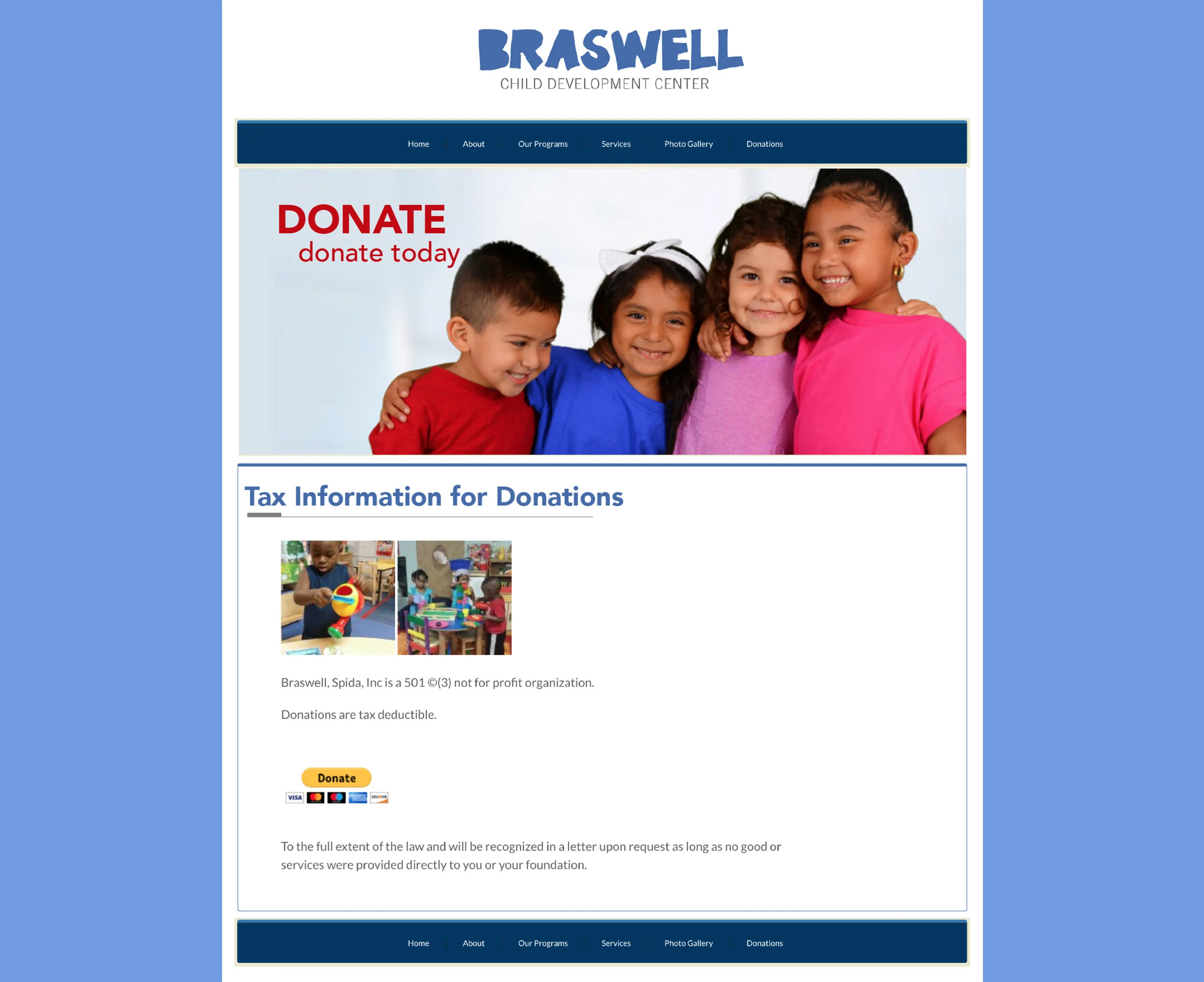
Redesign of Braswell Child Development Center’s website
Project Type: Website redesign
My Role: UI Designer, Front-end Designer
Tools: Dreamweaver, Illustrator
OBJECTIVE
repeated information
Increase customer traffic to a child care website through a redesign and streamlining content.
OUTCOME
easier navigation
Through competitive analysis, I determined key areas to focus on for a revamped site design, that will better appeal to younger parents. I created wireframes to figure out how to better format content.
Competitive Analysis
I compared 3 different child care sites
Kosmic Kids - Many of the pages have either a contact form, or a link to one. The site is responsive, each page has an image, and the contact page has an embedded Google map. Prices are displayed for each age group.
Peaceful Images - This site is very plain, text heavy, and has some unnecessary background effects on some pages. Peaceful Images doesn’t seem to have a logo, so users would have to continue reading in order to know the company name. The red navigation bar contrasts badly with the blue background, and the dropdown menu is difficult to read because the content behind it can be seen.
Happy House Day Care - The site is responsive and their phone number is prominently displayed under the header and towards the bottom of the page. Some negatives are that the header is very large and takes up most of the screen, and there’s a contact form on every page.
Design Process
Create mockups based on research
Site Functions:
Images of children from various age groups that the center cares for
PDF of application form
View programs
Times of operation
Link to Facebook
Contact section and address
Mock ups
First iteration
Multi-page
Screen size: Desktop
The site had multiple pages in the original design I came up with. After sorting through the content, I then realized that some of the pages were repeating some of the same information.


Second iteration
Single Page
Screen size: Desktop
After combining related content, I decided that a single-page layout was the best fit. This design is more colorful and much more inviting than both my first iteration and the previous site. This layout has clearly labeled sections, and allows for quicker access to information without re-reading the same things.
Notes
Pictures of notes from my design process


What could have been better?
If I could do this project over, I would make the buttons bigger, and display Braswell’s phone number at the top of the page. I would also find a better way to optimize the site for mobile users. I added break points to my code, but they sometimes didn’t apply like they should. Another thing I might add is some sort of design on the background, instead of a boring solid blue.
What I learned
For this to have been my first web design contract project, I’m proud of the result. This project gave me insight into how to communicate with a client during a project, how to plan when on a deadline, and how to negotiate getting paid what my skills are worth. I learned a lot from the whole process, and took plenty of notes to improve in the future!